November 12, 2022
Hacking
November 12, 2022

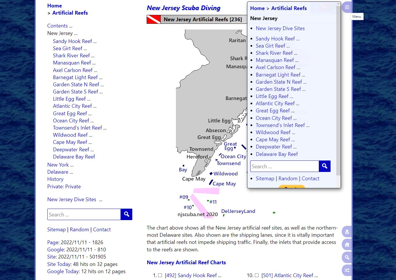
I've been hacking up a storm, and I've made some major improvements to the mobile navigation menus, as you can see in the very meta screenshot above. In fact, it's now almost as good on a cellphone as on a big desktop computer. This website has well over a thousand pages, which calls for excellent navigation features if you're ever going to find anything. That's a real problem on a tiny cellphone screen - where do you put it?
It all lives in that little tab at the upper right, which takes up hardly any screen space. The menu itself is now scrollable, and adapts to whatever space is available. It shows all the relevant directions you could go, almost but not quite the same as the desktop sidebar. The mobile navigation is now so good that I decided to leave it turned on all the time.
I don't believe in the "mobile first" paradigm of web design - I think that results in a crummy design that inflates into a bigger crummy design. My method has always been desktop-first, and if it works on smaller devices too, great. It's always worked pretty well on a tablet, but I am just shocked at how well it works now on a phone.
I also did a lot of hacking on the back-end, mainly to keep track of what WordPress is doing behind my back, and stop it. Like deleting images all on its own! That's not helpful.

